Author
Bob Visser
CoffeeCup Chief
Design
Diego Naves
Master of art
Edits
Suzanne Norvell
Customer befriender
Production rights
© CoffeeCup Software
www.coffeecup.com
For anyone with an understanding of CSS or a little experience with any of the front-end frameworks, working with Foundation Framer will be as intuitive as riding a bike…with the wind at your back!
The layout and design controls are a visual representation of CSS. This creates a familiar workflow and makes Foundation Framer flexible and powerful. It also makes it easy to tinker and learn for those with a different level of experience.
Foundation Framer is an excellent tool for those interested in learning to design with front-end frameworks, such as Foundation or Bootstrap. The visual controls, width slider, real-time preview and undo system make it easy to experiment and learn by doing.
This tips template covers the basics and offers some guidance for those just getting started with the app. It is also included in the app itself, and shows a bunch of neat design and layout examples.
A list of tips for getting started with Foundation Framer can be found below. To quickly jump to a specific tip you can view this template in the browser by clicking on the Preview on… button on the toolbar above. Then simply click on a tip and the browser will scroll to that position.
You can also launch these tips in your browser using the HELP menu option above.
From the browser you can also drill down into a topic by clicking on links included in the tips. This will take you to a tutorial on our website with more information.
Several gorgeous themes and templates with cool design tricks have been included in the app. You can browse and access them from the Theme browser.
01.
Dropping picture elements, changing images.
02.
Adding, formatting and linking text.
03.
Managing the responsive grid.
04.
Using selectors for an efficient design workflow.
05.
Get help from themes, tools and prebuilt components.
06.
View the design at all widths — create breakpoints.
07.
Working with subgrids and containers.
08.
Centering content in full width rows.
We usually start our designs with placeholder images. But at some point in the process these placeholder images will need to be replaced with the real deal. Here’s how.
Double-clicking the placeholder image will automatically launch the Design pane. You can also click on the pane tab directly or right-click on the image.
Use the Picture dropdown to choose a source. For online images you can simply paste the link.
Local pictures can be added to the project resources and will be included in the export or upload.
The element will take the dimensions of the new image, unless different styles have been specified.
Scroll down to the Style section. One of the first adjustments made is often the max-width value under Dimensions.
A whole variety of other design controls are available further below.
Pictures can also be changed at breakpoints — serving smaller size images to mobile users increases the performance and makes them happy!
Want to learn more about working with responsive images? Check out this article written by Suzanne.
In Text Edit Mode you can paste, or type text. Selected parts of the text can be given a distinctive formatting or turned into a text link.
The text editor can be activated with a right-click and choosing Edit Text option. You can also triple-click the element or use the Edit Text button (below the ID input box on the Design pane).
You can select portions of the texts to add Links or format them differently from the unselected text.
These (inline) styles can be given a Class name for easy reuse and updating.
We also have a comprehensive article and video tutorial (originally made for RSD) that describes the various linking options in more detail.
Use the Typography controls on the Design pane to style the text of the entire element.
The formatting tools look and work the same but only affect the selected text (and the previous selections that have been given the same class name).
Want to learn more about web typography and inline formatting? Suzanne is writing a great article as we speak, make sure to be subscribed to our newsletter so we can let you know when it’s done!
In web design grids are very similar to a spreadsheet. They consist of rows and content columns (cells) for aligning and organizing page elements.
Each row can be divided in a number of content columns. The maximum number depends on the grid configuration. The default is 12 columns, which will work fine in almost all cases.
The example above has 4 rows. The 1st two rows both have 2 content columns.That means each content column will take up 6 grid columns (out of 12).
The Layout pane has a bunch of tools for managing and configuring the grid. Columns can be added, merged and Span widths can be adjusted.
When the total span of the columns in a row exceeds the maximum, they will stack. This can be used to make layout changes at breakpoints.
In the above example the span widths of the columns in row 3 are different on the left of the breakpoint (the white dot) then what we saw in the 1st image.
Here column 1 and 2 use a span of 6 (out of 12 — half of the width). This made the 3rd column stack. The span width for the 3rd column has been set to the maximum number of 12 so it takes up the full width.
Flexible and adaptable layouts are key to any really responsive design. Here’s an article that talks about this in more detail.
A CSS selector actually selects the element or group of elements the design styles are applied to. They are an incredibly powerful design instrument, but without prior experience might take a little to get used to.
A selector can be used to target all elements of the same type, such as paragraphs, headings — even columns and rows.
The Class selector is usually more frequently used and therefore the default option in the Apply to dropdown. But that mainly happens at the later stages of the design. The most efficient workflow is to first define styles for element types.
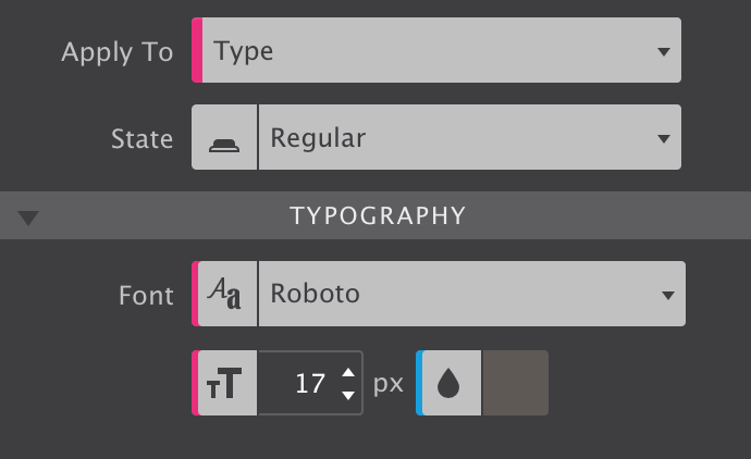
This way a common ‘starting style' for all elements of that type can be defined. For example Roboto can be set as default font-family for all paragraphs. Whenever a new paragraph is added, these styles will already be present.
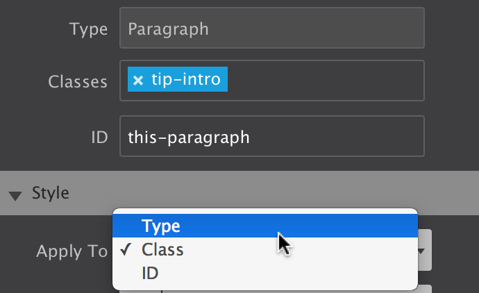
To apply styles on a per type basis choose the Type selector from the Apply to dropdown before using the design controls further down below.
As can be seen from the above image, styles applied to the type have a pink indicator. These style settings are applied to all elements of that type (e.g. heading 1, paragraph or picture).
With all default styles for the elements in place, Classes can be added to create design variations. For example, certain paragraphs that perform a different role can be given a different font family, size and/or color using a class selector.
To apply styles to a Class simply enter a (semantic) name in the Classes box and make sure to select Class in the Apply to dropdown. Now all style adjustments to the design controls below will be tied to that class and use a blue indicator like the font color above.
Some selectors are more powerful than others, their styles will prevail. In CSS this is called specificity, the styles from a more specific selector will take precedence over styles from less specific selectors.
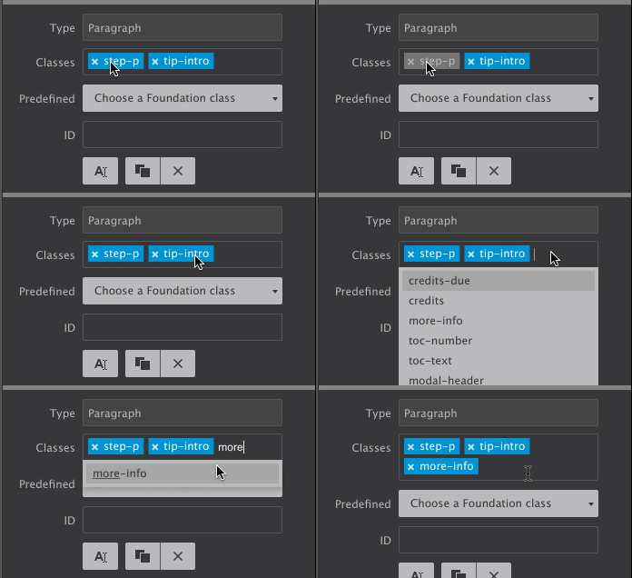
A Class selector is more specific than a style applied to a Type and will therefore prevail. Styles attached to a class selector can be reused — simply type the class name in the Class input box of the selected element! The image above shows that the auto-complete can be a great help!
An element can be targetted by up to 5 different classes. Styles can be applied to a specific class selector by deselecting other classes. Deselected classes are gray (see ’tip-intro' above). Style updates will not apply to them.
The proper use of selectors can speed up the design process and simplify the maintenance of a site. The tip info above is already a great help, the next sub-tip makes it even better!
A CSS selector actually selects the element or group of elements the design styles are applied to. They are an incredibly powerful design instrument, but without prior experience might take a little to get used to.
The default foundation button styles are shown in the top left button. Clearly these styles can be changed for the button class, creating a different ‘default' button. Variations can be created by adding multiple classes. Again the foundation framework provides several predefined styles, like ‘large’ and ‘success’. To customize these styles deselect other classes (as in the image) above before making the tweaks. In this example the text color for the succes button has been set to #136a1d.
The Predefined dropdown gives access to the classes used by the foundation framework. The foundation documentation provides more details about these classes. Further down below the different selectors, Type, Class and ID, are being shown.
Styles can also be attached to class combinations. A class combination is more specific than a single class. Therefore these styles will take precedence.
To apply styles to a combination, deselect the class(es) that are not part of the combination by clicking on their name(s), Then simply update the style settings as before.
The Foundation framework provides a number of predefined classes that apply styles such as the red and green in the image. They can be searched and selected from the Predefined dropdown. You can also find them in the foundation documents.
The blue button in the image above shows the default styles for the 'button' class. Additional classes create variations; the class ‘alert’ makes the button red, the class ‘large’ increases the font-size, etc.
Click here to view a larger version of the image.
To help you keep track of where style definitions come from — which selector the styles are associated with — Foundation Framer uses a color coding system.
The image above shows 4 different colors on the style controls. We already saw that pink is associated with style definitions for an element type.
The text color has a blue indicator, showing that this was adjusted through a class (the ‘success’ class in the previous image).
The yellow indicator tells us that the font weight (bold) is set for this specific element only —on the ID. Styles set on IDs are more specific than classes — they apply to only a specific element — and will always prevail.
The gray indicator shows that the font size is tied to a class which is not selected. In this case, this is the ‘button’ class.
If styles are applied to multiple selectors, e.g. a type and a class selector, the control shows the value that of the active selector. However, the value that prevails and shows in the preview area might come from a more powerful selector.
Also here the color indicators can be a great help. For example, when a class selector is active but the control shows a yellow indicator, the style comes from the ID. Simply switch to the ID selector from the Apply to dropdown to see the (applied) value that corresponds to the ID.
A pseudo-class can be used to specify a special state of the element to be targetted by a selector. For example :hover will apply a style when the user hovers over the element specified by the selector.
The pseudo classes currently available in Foundation Framer can be selected from the State dropdown.
Reset anything, anywhere!
The Reset function helps to keep the project code lean and clean. Applied styles to a breakpoint instead of working on the default styles? Want to use margin instead of padding after some consideration? Don’t created a bloated style sheet with confliciting rules. Instead simply remove the styles where you don’t need them and (re)apply exactly where you want them to be.
The dropdown gives an overview of the styles that have been applied at the current position of the slider, as well as the overall styles. Specific styles can be removed by clicking on them, or all styles can be whiped out at once.
Lastly the order in which the style rules have been created play a role in specificity: the last rule is considered more specific and applies. Not the last edit, The proper use of selectors can speed up the design process and simplify the maintenance of a site. In this article, Bob explains the use of selectors and multiple classes in more detail.
Our themes not only look great, but include explanatory texts that can be a massive help in learning how to create specific design effects. The Inspector pane can be helpful and give insight too!
We are in the process of swapping out the simple filler text in the themes for explanations that describe how certain design effects have been created.
These sections mention how the HTML is organized — if containers are used for example. On the design pane you can see what styles have been applied.
In the same way the prebuilt components can be added to a page and studied. Look at the HTML structure, design styles and data attributes to create a good understanding of how Foundation Framer works.
Foundation Framer is an excellent learning tool! At any point you can jump to the Inspector pane and look at the HTML structure and CSS properties for the selected element yourself.
Just right-click an element and select Go to > Inspector. The element order and associated CSS for each HTML element is shown. The CSS is still edited on the Design pane only (for now).
The elements can also be dragged and dropped in the inspector to different position, changing the element order. This can come handy at times when the drop zones or elements in the preview area are small.
You can also hover elements, and view the outline in the preview area. This helps to understand how much extra space (margin, padding) an elements takes up.
Move the width slider to the right and left to view the design at all possible widths. Use breakpoints where needed to adjust the layout or elements.
The Foundation framework follows a Mobile-first workflow. That means that the design is created on a small screen first, then adapted or extended for larger screens with more room. Foundation Framer makes this easy, even allowing to create custom breakpoints with a single click. Following the creation of the breakpoint, the text size of the navigation buttons is increased.
The blue dots represent the default Foundation breakpoints. At the first blue dot a left sidebar is brought into view. Then, scrolling down, the layout is changed to a two column structure. At the next blue dot this becomes a three column structure. You can also zoom out to design for extra large screens from, for example, a laptop.
Clearly this only scratches the possibilities of what can be done, but it’s a nice illustration nevertheless!
Responsive Design does not mean designing for a tablet or iPhone — it means designing for any width.
The width slider can be used to view the design at any possible viewport width and is instrumental for creating websites that look good on any screen and device.
The Foundation framework uses a Mobile -First workflow, which means that you will want to move the slider to the right on a regular basis and adjust the layout and design for wider viewports.
This video illustrates a few of the endless possibilities.
The white dots with the + and - can be used to add (or remove) breakpoints. The dots will be added above the current position of the slider, at the pixel value displayed at the left of the device indicators.
The device icons indicate what type of devices are likely to be used at the current width. With all the different device sizes they are just in indication.
Foundation gives you 2 breakpoints to begin with which are displayed in blue. These can not be moved but you can create custom breakpoints to accommodate your content at other sizes.
Any style, from column spans to border colors, can be adjusted at a breakpoint. A breakpoint is active, receptive to style changes, when the white dot has a black center.
In the example above this means that, for example, a larger font size could be applied as of the left dot. These new styles will continue to be applied all the way to the right, unless other changes are applied at a next breakpoint.
In a Mobile-first workflow breakpoints are active when the slider is positioned on the right of the dot. Desktop-down designs work the other way around.
New: Breakpoint Mode allows you to work on the styles for a specific breakpoint independent of the slider position. You can also work on the default styles by disabling all breakpoints. This mode is super handy when working on a Mobile-first design; you can work on texts etc on a wider screen without running the risk of updating desktop styles only.
Subgrids and containers provide additional control over the layout design and help to create layout variations for different screen widths. Nested containers offer a lot of Flexbox-based layout opportunities.
A subgrid is a special container with rows and columns. It allows for the same layout manipulation as a normal grid. Rows can be added and their dimensions altered, column widths can be adjusted with the Span width control on the Layout pane and they can be made to stack at breakpoints.
A good use-case for subgrids is when you have a full-width row. Subgrids can keep all the elements centered while allowing for content organization and layout (re)structuring (at breakpoints).
Containers can be used to create (visual) element groups like the ‘activity cards’ shown above. They can hold, buttons, text, pictures and even a subgrid. Containers can also be placed in subgrid columns and in other containers..
Bonus: you can use them (as overlay) to create cool hover effects and interactivity. Check out the Flexbox Cards component for an example.
Flexible and adaptable layouts are key to any really responsive design. Here’s an article that talks about this in more detail.
A popular design choice is to have a background that stretches across the screen, while the content such as text and buttons stay constrained in the center.
Add a row and change the max-width to none from within the Design pane.
This will allow the row to expand out full screen for the viewer. It’s great for stretching the navigation bar (see orange bar in example) or creating a section with a background image that fills the entire window (see step 3).
To keep site content in the row from expanding too wide, a max-width can be used to constrain and then center elements. For more control over groups of elements, a container or subgrid element can be added.
Specify a max-width that corresponds to the width of the other rows (or any other value relevant to the design intent).
The container (subgrid) can be centered by setting the left and right margins to auto. Alternatively, you can now use Flexbox for this. Simply set the display control in the Position section to flex and BAM…all types of cool layout controls pop up.
Now you’re ready to add your content. Drag-n-drop content elements into the container or subgrid as you see fit. These elements will stay restrained to the width you set in the previous step.
The items can be positioned within the subgrid columns or container in the same way they can be positioned in a normal column.
For more centering, positioning and alignment options, check out this tip.
Use the HTML Element for adding your own code snippets or exports from other apps such as Form Builder and Responsive Content Slider.
Place the HTML Element where you want the custom code or object to appear. This works great for all types of objects, from menus and web forms, to cool slideshows.
These objects can be exported from our enhancement apps like Form Builder, but also be come from 3rd party apps of widgets.
The code can be inserted into the HTML box on the Design pane. In the example above the code for a slideshow is shown.
The HTML Element can be positioned and styled just like other elements with borders, backgrounds, etc.
Yep, creating a larger box for adding and editing the code is on the development roadmap. ☺
Stylesheets and other resource files can be linked using the Head (or Footer) boxes.
To not interfere with the internals of Foundation Framer, some objects, mostly the ones using Javascript, can not be previewed live in the working area (right now).
However, you can use the ‘Preview on…’ button on the toolbar and interact with them in the browser.
Scott describes how a slide show can be added to a page in 6 simple steps.
Positioning elements is easy…but there are so many possibilities that this may seem daunting at first. Let’s summarizes our options.
The display property plays an important role when it comes to the placement of elements. Most elements are displayed block by default. They take up all available horizontal space, and will always stack on top of each other.
Setting the display to inline-block places the elements next to each other. Just like block elements they can be ‘moved’ from that position using margin and padding.
Using display: inline places the elements on one line, just like inline-block. However, this time margin and padding will not have any vertically impact.
More details about placing and aligning elements using these display properties are included in this secret tip.
Using float is yet another option for placing elements next to each other. Floats were originally intended for text wrapping around other elements such as pictures. However, floats work really well for many layout constructs, including building an entire responsive grid system!
Flexbox offers all the layout options that floats bring, and more. However, it can not be used for text wrapping and large layout constructs (can) shift around when loading. Don’t let that last part scare you though, within the grid we've started to use flexbox as our preferred method for arranging elements.
This tip contains a few more details about floating elements. For a good overview of flexbox please read our Flexbox guide.
The position property provides additional rules for placing elements. The most most common values for this property are static and relative.
Nothing new here, both behave according to the (display) rules mentioned before. Relative positioned elements however can also be ‘pushed’ using the top, left, right and bottom properties.
An absolute element can be positioned anywhere using the same offset properties as relative elements.
These last two values should be used with care in a responsive design. Here’s a bonus tip that helps taming the super powers positioning offers.
It might take a little to get used to…but once you do you’ll be pushing these elements around like a boss!
Block level elements will always stack. Even if their widths are constrained (using max-width for example) with enough space for both to sit on a single line. The only exception is when the flex-direction property is set. Then the element will behave according to the direction value set on the parent element.
The picture elements above provides a good example. We opted to use block and a max-width: 400px as default value for them in our grid framework. This way centering them is as easy as setting the margin values for the left and right both to auto.
Block level elements naturally flow to the top-left of their parent. They can be ‘pushed’ from that position using top or left margin. Padding has the same visual effect but extends the background of the element.
Block level elements that do not take up the full space can also be left-aligned, right-aligned or horizontally centered using the auto values for theses margins.
Setting the margin-left to auto pushes a block element to the right side of the parent. A right margin can then be used to move it back a little. As mentioned above, setting both the left and right margin values to auto will horizontally center a block element within the parent. Inline-blocks behave differently here.
A convenient method for placing elements next to each other within the same parent is using the inline-block value for the display property. The width and height properties continue to be respected by the browser, similar to how they work for block level elements. However, inline-block elements can not be centered with the margin controls.
In this case centering can be achieved through the text-align control for the parent element. Selecting the parent (column or container) and setting text-align to center under the Typography section will center all its children.
The inline-block navigation links above have been centered as just explained. The inline display value works in a similar way. As expected, this will always place the elements inline — margin and padding will push the other elements away, but only horizontally and never vertically.
Just as the inline-blocks, inline elements can be right-aligned and centered using the text-align control of the parent container.
Elements can also be pushed down or to the right by adding padding to the top or left side of the parent (column or container) element. It will keep them aligned!
And yea, automatic vertical centering is not possible using this property set. Luckily we have Flexbox now!
From floating to flexing.
Using the float property is yet another option for placing elements next to each other. This method is often used — and was originally intended — for pictures with text wrapped around it.
Float can also be used to push the elements to the far right (or left) of the containing parent element.
Although floats work really well in most cases, sometimes there are unintended side effects (although less now older versions of IE are rapidly disappearing).
One effect is that the parent element does not automatically take up (minimally) the same height as the floated element. This isn't always noticeable if the parent doesn't use a background color or image, but it is something to be aware of.
Another example is that the order of the elements changes when they are floated to the right.
The element that was positioned first (left) in the HTML order, will be visually positioned on the far right. This can be undesirable when the float: right is removed at a breakpoint.
For these cases it is nowadays better to use Flexbox — with the widespread browser support this is something we @CoffeeCup are increasingly doing.
The icing on the CSS cake.
Static is the position value applied by the browser if no other value has been specified. These elements behave exactly as you would expect, according to the rules defined by the display property. In most cases that will be stacking and floating to the left (block elements).
Relative positioned elements behave very similar to static elements with two exceptions. First of all they allow you to apply an offset value. An offset of left: 10px will push the element 10 pixels from the left, very similar to the element would shift when a margin would be applied.
Secondly, a relative positioned element creates a coordinate system for its children. This coordinate system serves as the reference point for any offset values the children might have. When using an absolute positioned element in a section, the parent container will almost always need to have a relative position.
An absolute element can be positioned anywhere in the design using the same offset properties as relatively positioned elements. These values are relative to the nearest ancestor that is not positioned static.
Element that are positioned absolutely are taken out of the flow, taking up no space and not influencing the position of the other elements. Usually the z-index property is increased to make sure the element is visible on top of the other elements.
Absolute positioned elements also possess a secret power: they can be stretched. This can, for example, be used to create perfectly fitting overlays that change to a semi-transparent color on hover.
In the example above an absolute positioned container with button is used as overlay. Using zero values for all four offsets ‘snaps’ the container within the parent. On hover the transparency is changed from 0 to 1 (with snazzy transition effect).
When the document body is the nearest positioned element providing the reference point, an absolute positioned element moves along when the page is scrolled.
An element with position: fixed uses the viewport as its coordinate system. This means it always stays at the exact same position, also when the page is scrolled.
The same top, right, bottom, and left offset properties are used to place the element.
A navigation bar or header is sometime positioned fixed to keep it in view, even when the page is scrolled. Another example is a button or icon that links back the top of the page or some other important page section.
All these controls are really powerful but there’s one thing to keep in mind. In the world of endless screen widths where content naturally flows down, they should be used with moderation and wisdom.
You can switch to other pages in the project using the drop down under the Pages icon in the toolbar. You can also change pages names and copy & paste content between them.
Simply select the page you want to view or work on from the drop down menu under the Pages icon on the toolbar. You can also use this menu to add empty (blank) pages or duplicate existing pages.
The ‘Manage Project’ option opens the page manager.
Double-clicking a page name allows you to edit the page name. Simply click out of the box or use the tab key to save the change.
You can create subpages by dropping a page another page. Pages are reordered when they are dropped in-between pages. In this case you will see a single horizontal line.
You do not need to duplicate pages to reuse certain elements as the footer or navigation. You can select any element, container, column or row and paste it onto any other page.
Since these elements share selectors (class or type) design changes will automatically apply to all of them, no matter what page they are on.
Through the use of Symbols content, such as text or images and even entire components such as footers and navigation modules, can be automatically updated as well.
We have big plans for the page manager, stay tuned!
Modular design. We are not designing sites or pages, instead we break it down in building blocks that together create the design. Each block has a specific purpose, a role to fulfil. Blocks are easier to manage, update and reuse. Rules can be tied to each block like what can edit what part, content or certain styles.
Libraries, components, patterns, modules, atoms, groups, blocks…. what’s in a name? Fact is that a modular approach to web design offer great benefits, both for the design team and the end-customer.
Responsive design has introduced an additional layer of complexity. Tools like Foundation framer take over a big part of the burden, but thinking about how the layout, dimensions and relative positions evolve across screen sizes is still required. This can be broken down in smaller, reusable elements.
Coffee, white doppio a caffeine in crema. Kopi-luwak cortado, turkish instant as organic decaffeinated trifecta plunger pot latte. Cream skinny, french press extra turkish barista, blue mountain saucer irish wings crema.
Cortado body irish instant cup sweet, cortado, percolator pumpkin spice bar pumpkin spice froth. As, white, in aged latte coffee cultivar. At macchiato, cultivar barista coffee, to go aromatic spoon aftertaste extraction skinny.
Keeping content in sync across multiple pages can be a royal pain in the behind. Symbols relieve you from that pain.
Any element or element group, including components, can be made a symbol. This is done on the on the content pane on the Symbols tab. With an element or element group selected, simply click on the New Symbol button.
Now the symbol can be added to various places in the project by clicking on the plus button next to the symbol. Any changes to a symbol will update all of the ‘instances’ and Foundation Framer will keep them all exactly the same everywhere.
In the above image the footer symbol is visible in the preview window whereas part of an instance of the symbol is visible on the left in the working area.
In the working area, when a symbol is selected, it is surrounded by an orange line. It will have an orange dot on the right in the tree view of the Inspector pane.
The available symbols can be previewed on the pane by simply clicking on them. When selected, they can also be renamed or removed.
A symbol can zoomed in or out in the preview window with the plus and minus buttons. This might trigger a breakpoint and change the design of the symbol. In the above example, a mobile version of the menu is previewed following a zoom.
For each symbol the number of instances is indicated next to the symbol name. The arrow buttons can be used to ‘skip to’ each one of them.
Foundation Framer also indicates on which pages the symbol has been placed. Selecting them from the drop down will take you right to that instance.
Symbols are a great way to to get content such as footers or navigation menus synchronized across pages. If, for example, a new footer link is added, it will be instantly added on all pages. Sweet!
Create hooks
Coffee, white doppio a caffeine in crema. Kopi-luwak cortado, turkish instant as organic decaffeinated trifecta plunger pot latte. Cream skinny, french press extra turkish barista, blue mountain saucer irish wings crema.
Cortado body irish instant cup sweet, cortado, percolator pumpkin spice bar pumpkin spice froth. As, white, in aged latte coffee cultivar. At macchiato, cultivar barista coffee, to go aromatic spoon aftertaste extraction skinny.
Create mobile slide-in menus, custom modals and anything else you can dream up. Just by specifying a few data attributes! Let’s see how this works.
The toggle function built into the foundation framework allows for creating all types of interactive elements by swapping out classes or revealing hidden items.
But don’t create a toggle just because you can...there has to be a purpose!
A navigation menu that is ‘out of the way’ on a small screen, but can be reached with a single click is a good example. Or a section (or image) that expands (or pops us) if requested by the user.
Defining the content structure includes determining which elements are going to be ‘grouped’ in the toggle, how it is triggered as well as the behavior over different screen widths.
After defining the content structure this is the easy step: an element simply becomes togglable by adding the data-toggler attribute. This can be done on the design pane on the Attributes section. In this case, no Value needs to be provided.
The data-animate attribute can be used to add animations. The Value specifies the animation that will be used, a slide in and out from the left in this case.
The element will also need to have an ID so it can be uniquely targetted by the element(s) that invoke the toggle.
One or more elements can be used to trigger the actual toggle. The only requirement is that these elements are ‘link elements’ such as the link-icon or link container, or use the .button class.
Then, also in the Attributes section on the Design pane, add the data-toggle attribute with the ID of the targeted elements as value.
The toggle shown in this example can both be triggered by the icon and text below it. The navigation container is visible by default on larger screens — therefore these ‘trigger elements’ are hidden there.
This navigation is included in the ‘Festival’ theme as a Symbol. This theme can be accessed from the New from Theme dialog under the File menu.
The Toggler is a very helpful for revealing additional information or displaying details based up interest from the user. For more options about the toggle options and animation possibilities please consult the Foundation documentation.